Information and History

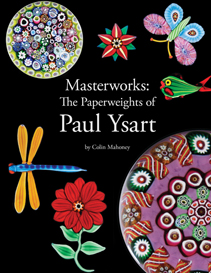
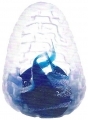
 Masterworks: The Paperweights of Paul Ysart

| Glass articles - Books |
Masterworks: The Paperweights of Paul Ysartby Colin Mahoney |
||
 |
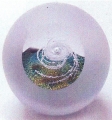
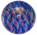
Review by Frank AndrewsWith the 400th anniversary of Scottish glassmaking, it is a delight to see so much being done to record Scotland’s glass history. This monograph on Paul Ysart is of particular value to that history. It sets out to complement the history of Paul Ysart in Ysart Glass, 1990, by Alison Clarke (now online here.), through a detailed study of his paperweights. And what a delight it is. Following a brief history that adds to the earlier story and a section on signatures, labels and certificates, Paul Ysart’s work is studied by design element:
|
|
|
This section is complemented with a few errors in weights and discussions of the fakes and of scientific testing (UV and specific gravity). These first 60 pages certainly give a good understanding of Paul Ysart’s approach to weight design, and ithe book will be extremely useful to collectors, both old and new, in recognising unsigned weights. The next 100 plus pages make up a comprehensive catalogue split into 36 basic design types. They are a feast for the eyes with many paperweights that few will have seen or instantly recognise as Paul’s work. However, the information from the first part of the book comes into effect and the clues leap out at you, in most cases. This book is a superb work and will be of the great value to all paperweight collectors, particularly of Scottish ones, although they had better hurry as it is limited edition of 500 copies. There is little of the detail that can be criticised but inevitably a few questions pop-up... The end of the catalogue section covers attribution and also the Spitfire paperweights once considered to be Paul Ysart’s work. Thanks to the signed example shown in this book, these are now known to have been made by Frank Eisner in England. See the Glass Message Board for ongoing discussion on Frank Eisner here. Unfortunately, Mahoney mentions that Frank Eisner worked at Moncrieff: the source for this error is found in the references on page 175, Annual Bulletin of the PCA, 1957, which states “Frank Eisner was the foreman at Moncrieff.” It was Frank's son Eric who had that job, and Frank only went to Perth after his retirement. Colin Mayor, a friend of the Eisner family as well as a director of Moncrieff, was clear that he had no knowledge of Frank Eisner ever having worked for Moncrieff. He added that Frank did go into the factory at weekends to made paperweights, but unfortunately most of these cracked during annealing. The only clear metal available to Frank was the firm's MS1, and this had a different coefficient of expansion to the coloured glass that he may have used for elements of the design. Another snippet from Colin Mayor (2005) is that when Paul set up at Harland he had his glass made by Moncrieff to his own recipe. and this explains the change in UV reaction mentioned on page 59. At that time, Colin still possessed this recipe. My only other concern is that the two pages on medallion or cap badge weights do not mention the belief that not all such weights are the work of Paul. This site has started to compile a catalogue of these badge weights so that a more thorough study can be undertaken as more examples and data comes to hand. There is further discussion on the Glass Message Board. The box shown on page 150 was from a range designed and made by Orkney silversmith David Hodge for Caithness Glass. Some examples are shown here. David, now retired, cannot recall how many were made but said it was not many, probably around 50. The range of jewellery was partly designed by Colin but also by Lucia Polanski, see the range shown here on this site and the article here. |
||
|
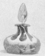
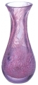
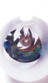
Monart shape T
from 1920s catalogue
|
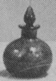
One of the high points for me was turning to page 159 and for the first time in years of searching seeing “Monart bottle shape T” with the stopper from “Monart bottle shape EJ,” both 5-in. (125-mm) bottles. A quick flip back to page 148 and there was another Monart bottle shape. It is known that millefiori canes were being used for Monart bottle stoppers before 1929, but I can see no reason why these were not used in the bases, although this does not appear to be the case in the poor catalogue images. Perhaps the use in stoppers was the inspiration for the two examples in Colin’s book. Clearly there is some more room for research! |
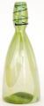
Monart shape EJ
from 1920s catalogue |
||
Book detailsMasterworks: The Paperweights of Paul Ysart by Colin Mahoney – 196 pages, full colour. ISBN 0-933756-67-4 Paperweight Press, Sant Cruz, Ca, USA, 2010, limited to 500 copies |
||||
| ← The Jacobites & Their Drinking Glasses | Directory of Scottish Glassmakers 2010 → |
|---|
| < Previous | Next > |
|---|

 |
Copyright ©2007, 2011, 2022 F Andrews. Rights are managed by Frank & Felicity Andrews. All text and images on this site are copyright as shown. By visiting this web-site you agree to these terms. |